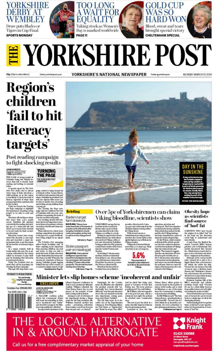
The Yorkshire Post has today relaunched with a “subtle” change in tone, new design, “improved” business and sport coverage and the return of ‘The’ to its masthead for the first time since 1968.
The Johnston Press title, which was founded in 1754, hopes to appeal to a broader readership with “new, fresh and entertaining news” while “keeping the authority and depth our existing customers expect”.
The Post on Tuesdays will feature an “improved, more authoritative business focus” while a personal finance section will be added on a Saturday.
There will also be more sports pages on a Saturday, a new nostalgia page, a Country and Farming page on Wednesdays and an extended Saturday Country Week.
Editor Jeremy Clifford said: “We are THE newspaper campaigning for Yorkshire. We set the agenda, identify the issues that concern the people of this region and ensure Yorkshire’s voice is heard.
“Our news coverage is changing. It will continue to reflect what our existing readers want, but it will seek out new, fresh and entertaining news from across the region. Our new readers will like the subtle change in tone, making it a newspaper with a broader appeal while keeping the authority and depth our existing customers expect.
“We are THE only newspaper in Yorkshire to debate the big issues – whether it’s HS2, fracking, renewable energy or the lack of investment in the north. We will be leading those debates through The Yorkshire Post newspaper, website and on the road.”
The Post, which saw daily circulation slide by 10.5% to 32,156 in the latest ABC figures, is supporting the changes with a six-figure poster ad campaign, social media campaign and in-print promotional and marketing plan.
Explaining the design changes further on the paper’s website, Clifford added: “Apart from the masthead, which has been re-drawn by typographical experts, taking the font back to its purest form, we have also increased the size of the body type to make the newspaper easier on the eye to read.
“There are new aspects to the design as well, introducing a lightness to the pages and modern design elements, while being careful to keep the design and look we know our readers expect.”


