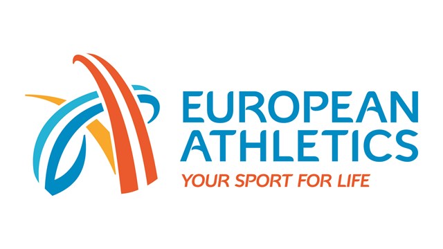
European Athletics has unveiled its new brand identity, created by Leeds agency, Works.
The 3 arcs each represent one element of athletics – running/walking, jumping and throwing. The blue and yellow colours are to symbolise Europe, with the orange meaning the sport of athletics.
“We are very pleased with our collaboration with design agency Works. Our overall corporate look has been strengthened when looking inwards and for communicating with partners and stakeholders, while the fan engagement and competition side has been liberated to maximise the excitement and energy around our events,” explained European Athletics CEO Christian Milz.
Works also created a bespoke typeface to use across the branding.
The new branding will be unveiled in stages across the organisation’s digital properties and upcoming events. Competition brand identities will be rolled out from 2017.

