Sun Branding has completed the rebrand of baking brand, Stork.
The Bradford agency was briefed to “dial up” its heritage, while at the same time bringing modernity, to connect both with traditional users and a new generation of home-bakers.
“We brought much-needed love to the brand by refining the iconic Stork logo, promoting it to centre stage and giving it the space it deserves,” explained Si Inman, Creative Director at Sun Branding.
“During our exploration of heritage messages, the phrase ‘100+ years of baking’ emerged as the most appealing to consumers. While polka dots can bring to mind a sense of nostalgia and playfulness, they also run the risk of seeming outdated or childish in today’s modern design codes. As brand-blocking has become prevalent in the spreads aisle, with private label imitating the yellow and pink palette, we strategically developed a distinct and clean design, utilising Stork’s rich heritage colours to achieve maximum impact and standout.”
Ross Gray, Senior Designer at Sun Branding added:
“Stork has long been recognised as a people’s brand, and we committed to evolve the brand while honouring its deep-rooted history notably The Stork Cookery Service of the 1940s.
“This community initiative provided advice to households on how to provide meals despite rationing restriction.”
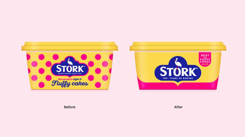
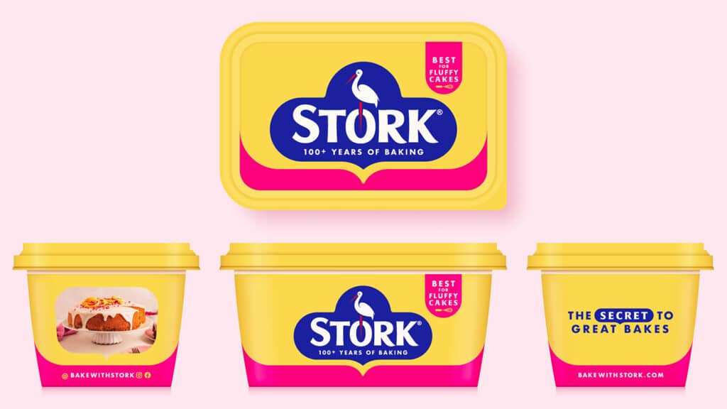
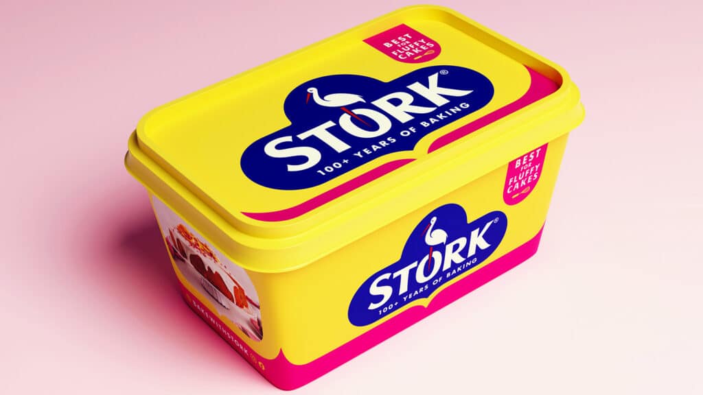
Sun explained that they developed a “simple and confident” visual language, such as the pink-line-device, which evolved from the idea of “baking memories”, the shape inspired by a timeline of memorable moments created through generations of baking with Stork.
It then created a complimentary recipe combining heritage with the Stork bakers of today, featuring real bakes made by star ‘Stork-ers’ on the side of packs, helping to connect with Stork’s growing Instagram community.
“We kept the brief relatively open, to allow the designers creative freedom to solve our challenge,” stated Julie Dang, Junior Brand Manager, Stork.
“The Sun creative team responded with impressive initial concepts which challenged us in the right way, and enabled the Stork team to focus on what we wanted to achieve, Sun listened and developed the designs further to absolutely nail it. They were collaborative and a pleasure to work with. Their way of working made our lives so much easier and the refreshed Stork packaging speaks boldly for itself.”
The full range launches next week.