I’m a simple chap. I don’t mind admitting it.
It has a bad rep sometimes, being “simple”. But for me it’s sometimes an art form – the challenge of demystifying a concept and trying to explain it to my mum.
I love the art of simplicity and everything that goes with it.
But figuring out how to make things simple in my life, for my team, for our customers and for our business is not simple in itself. It takes up a huge amount of my time and energy. It requires specific creative thinking and effort to get it right – checking and challenging that there’s nothing complex about what you’re doing.
It also requires courage.
When making things simple, it takes courage to decide what not to do, who not to please, what to sacrifice for the greater good, and when to take a leap of faith not to oversimplify.
When aiming for simple, it takes courage not to compromise, whether trying to please a senior stakeholder or a function in your business. Many times in development of our creative concepts I hear, “we can just add this”, or “we can include these words” – each time moving further away from simplicity.
The courage to stay simple rings true when developing strategy, creative concepts, customer propositions or anything which ends up needing to be understood by anyone.
We often forget that customers are simple too – they don’t understand complex business concepts or technical products, and they certainly don’t have time to grasp complex concepts with the amount of information beamed into their brains daily.
We, as marketers, need to be conscious of the concept of simplicity in everything we do, and be courageous to challenge those who seek to disrupt simplicity.
I want to share some of the times I’ve been reminded about being courageous in my quest for simplicity – and the lessons I’ve learnt in the last few years.
Plusnet’s strategy
Plusnet’s brand strategy is named ‘Brilliantly Basic’. It’s about us delivering broadband that meets our customers basic needs, in brilliant ways.
It’s not about poor quality or compromising on service, it’s about having simple products that just work, fair pricing and a responsive UK-based service. All the things our customers really care about, and none of the things they don’t.
For us to adopt this strategy, we had to be courageous about what we were going to stop work on: Plusnet’s TV service, our differentiated pricing strategies, improving landlines, new mobile products – all of which would grow revenue and enhance customer experience. But all of this would detract from our core broadband strategy and deliver extra choices for customers, hence less simplicity.
This may be an easy argument to make when it comes to single-minded customer messages, but certainly much harder when talking to bean-counters and looking at future revenue opportunities.
Being courageous in pursuing a simplified strategy wasn’t easy. It involved many pitches to key stakeholders, reworked business cases, financial recalculations, and a leap of faith that a simplified business would mean lower costs, therefore an improved financial outlook.
A year into executing our strategy and we can see that this approach has worked. By cutting through the complexity, our people can explain our strategy, our creative agencies can recite it, and frontline advisors and even customers in focus groups can understand what we’re all about.
Our creative platform
Simplicity and courage also shines through in our refreshed creative platform: ‘That’ll do’.
The approach brings to life that pleasant feeling when you get more than you bargained for, but also showcases a quintessential Yorkshire phrase – “That’ll do” – used when finding an extra fiver in your pocket, right through to winning EuroMillions, equally in an understated way.
Here’s one of our TV spots if you haven’t seen them:
Interestingly, this courageousness to keep things simple was about us not changing things.
A whole new management team and marketing team were keen to stamp their own mark on the Plusnet brand – me included. This is where creatives and agencies get excited – reinvention and brand re-launches!
The problems we thought we were trying to solve were as follows:
- We’d been reusing creative ideas for 18 months, given a lack of budget and strategy
- Our brand recognition was tightly linked to our lead character: Plusnet Joe
- We couldn’t be “too Yorkshire”, for fear of people thinking you could only buy Plusnet products in the North of England
After a while of trying to solve these problems, and looking at various collections of our own insight and industry brand trackers, we asked: Why had we been reusing creative? Why did we keep Plusnet Joe? Why play the Yorkshire card?
The answer to these was simple: it worked. We’d been deep in conceptual development of something just too smart.
We were courageous as a team, and embraced the art of simplicity, for not trying to get customers to consider a whole new brand platform, not bowing to our own egos to invent something new, not throwing out something that initially seemed tired – and mostly for taking our previous four-word brand tagline – “We’ll do you proud” – and simplifying it to two.
That’ll do.
Simplicity inspirations
Here are some of my favourite examples of day-to-day simplicity – where Creative Courage won out, so there was no compromise on what was easy for customers or users to comprehend:
- Monzo – I got a new debit card in the post the other day. The packaging had no instructions on it whatsoever, just a nod to the app. And because that was so simple, I knew just what to do. And did it immediately.
- Netflix’s pricing plans were revolutionary in their simplicity – all-you-can-eat content based on how many screens you wanted to watch on. No trying to pick if you wanted sport or movies – just how many devices you needed.
- The London Underground has simplicity baked in everywhere – the signage, the way you navigate between platforms, and the tube map itself. It caters for millions of visitors, many who’ll have language barriers, but need to get around one of the biggest cities on earth. The simple schematic map design of Harry Beck is a creative masterpiece.
- Restaurants who do one thing and do it incredibly well – Chicken Shop in London has three mains on their menu: A whole, a half and a quarter. Sister restaurant Dirty Burger used to have the choice of cheeseburger, or cheeseburger with bacon. No time to stare at a long menu, no need to print or design it either. But customers know what they’re getting.
So kudos to anyone reading involved with those brands that help make my life simple. And a big encouragement to everyone else to challenge yourself, or anyone else who introduces unnecessary complexity into the creative output. Be courageous.
Those of us who are just simple people will thank you for it.
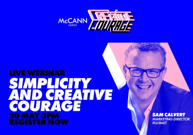
To register for the McCann Leeds Creative Courage webinar taking place on May 20th, hosted on Zoom, click here.


