Radlinski: “We see this being more than a new badge, it’s a complete strategic and cultural shift for the club.”
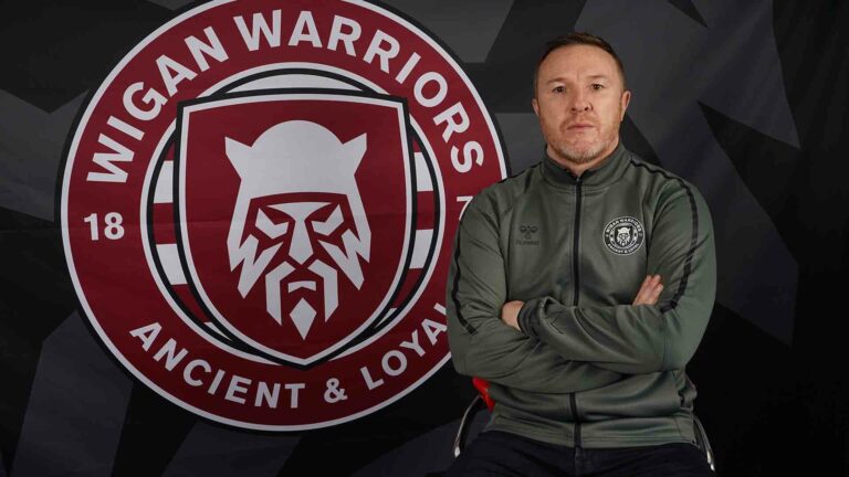
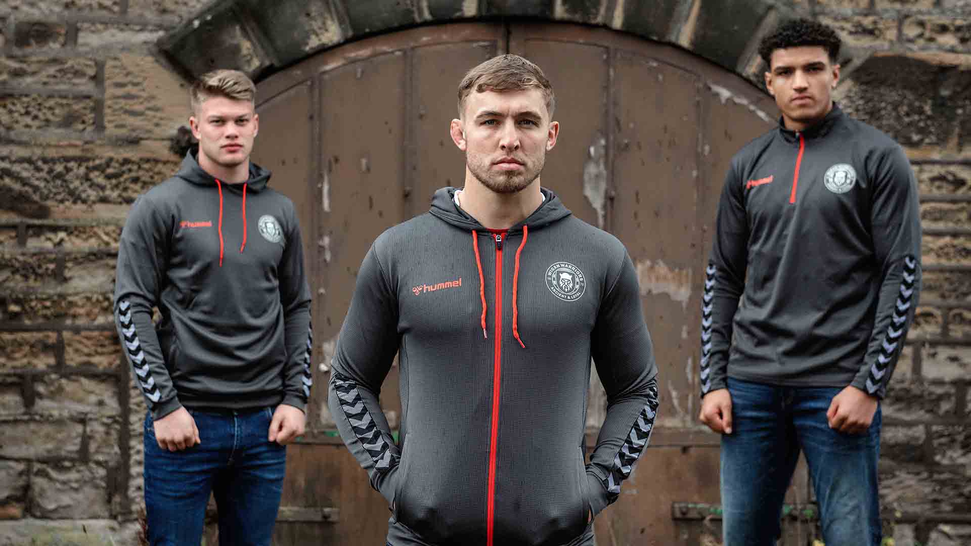
In a game full of tradition, Wigan Warriors, has unveiled a modern rebrand, including an update of its historic club crest.
It’s been led by the Executive Director and Warrior’s legend, Kris Radlinski, who spoke to Prolific North about the decision.
“We have been thinking about modernising the crest for some time but the need to do so was reaffirmed when Super League did an independent audit of each club’s brand in early 2019. The feedback was that our crest was outdated, certainly for an ambitious club like ourselves,” he explained.
“The ambition was to produce something far more modern, along the same lines of NFL franchises where each team’s logo is clean, striking and recognisable. We wanted to achieve something similarly striking to grow the club and in-turn help grow the sport.”
So, talk us through the new look.
“We see the new badge as being very striking and something that will take us forward in the modern era. Whilst the badge looks very different, we have been conscious of retaining important elements from the old crest based upon feedback we received from our fan consultations.
“Our club motto ‘Ancient and Loyal’ has remained as has 1872, our year of formation. The shield is the same shield as our original crest, although we’ve brought this up to date and incorporated the Cherry and White hoops behind it. The biggest change is the Warrior which depicts a Brigante warrior which roamed our town in the Iron Age. People say that Wiganers have a steely look in their eye – we wanted to capture this fierceness and determination which will be a big part of our brand moving forward. Whilst it is a significant change, when you start to deconstruct the badge and explain its elements, it builds a compelling story.”
This includes two “W”s hidden in the design of the Warrior, to represent the club’s name.
Subscribe to the Prolific North Daily Newsletter Today!
Want all the latest content from Prolific North delivered direct to your inbox daily? Of course you do!
Radlinski explained that the process started 12 months ago, first with “an extensive consultation process” with key stakeholders and fans. Then it commissioned design agency Nomad, which has previously worked on the Premier League rebrand.
“We embarked on a wide-ranging consultation process involving a diverse fan panel of all ages and backgrounds. Our club historian has been part of the process and whilst we expected him to be the most protective of the crest, he understood and was supportive of the need for change which gave us confidence.
“Our chairman and his family, who has been the custodian of this club for many years, has been heavily involved and encouraged us that if we were to take on this project, we should be going for something radically different which has the power to be truly transformational. We have also consulted with players and former players, our commercial partners plus Super League and their main broadcast partner Sky Sports.”
He added that the badge had been signed off pre-Covid-19 and in the last few months “around twelve of our senior staff across all departments have been working around the clock in preparation for the launch.”
What has the initial reaction been?
“The initial reaction has been very strong, particularly from our commercial partners and suppliers who have considerable experience in the industry working with other leading global clubs.
“They very much see us as having established a strong, dynamic brand, whilst in doing so acknowledging that we have respected tradition. Our partners have also remarked that they admire our bravery and ambition to move forward with this rebrand during a challenging time where most organisations are cutting their marketing budgets. We are encouraged by this and see this rebrand as a beacon of hope for not only our club but also the town of Wigan and the sport of rugby league.”
Have you had any worries during the process? And given the difficult times we’re currently in, did you think about delaying it?
“Naturally there was an initial nervousness around making such a big change because Wigan is a very traditional town, there will be people with the crest tattooed on their body and on gravestones.
“As a former player, I appreciate what this club means to a lot of people and know the responsibility that has fallen on our shoulders. However, the further into the process we have gotten, the nerves have turned to excitement where we are looking forward to sharing our story, working towards our ambitions and embracing the challenges that lie ahead. I actually think that the current climate works to our advantage – people want some good news and we see ourselves being a beacon of hope. Everything we are doing is to make us better as a club, we want to come out of covid thriving rather than just surviving.”
This seems more than a rebrand, almost a refocus for the Warriors?
“We see this being more than a new badge, it’s a complete strategic and cultural shift for the club where we are looking to improve in all areas right from commercial through to how we engage with our fans on digital and within the community.
“The main key drivers are to attract new fans, stand out on broadcast and digital platforms and pursue new commercial opportunities. I believe the rebrand will breathe life into all areas of the club and allow us to produce a world-class offering in all areas.”
In addition to working with Nomad, the club employed Nick Payne from Robin Brand Consultants to guide it through the consultation. Retained agency, Fishtank have built a new microsite, updated the existing site and created online content.
The main launch video was produced by Phil Pickard from Short Stories, which interestingly isn’t presented by a rugby league player. Instead the club has picked UFC fighter (and Wiganer), Mike Grundy.
“Mike Grundy epitomises what it means to be a warrior – he is tough, resilient and a proud Wiganer. Our first-team have trained with him on several occasions within the past few years, to the extent where he feels part of the club. But first and foremost, he is a fan and represents the sort of person that we want to buy into this rebrand,” explained Radlinski.
“Additionally, part of our ambition for the rebrand is to present ourselves as more Warrior-like, to be a little more current and edgy. On the night of the launch, for example, we will take a massive projector and shine the crest onto the stadiums of St Helens and Warrington who are two of our most fierce rivals. We are rethinking everything we do in order present ourselves as more Warrior-like and to broaden our appeal.”
You clearly have big plans for the future of the Warriors and have talked about broadening your appeal, what is the ultimate aim of the rebrand?
“We certainly have bold plans as part of the rebrand which we hope to be a line in the sand where we’ll look to improve in all areas of the club. In the hyper-connected world we find ourselves in where competition for attention is so fierce, attracting younger fans is a major challenge for any sports team.
“We think this new badge will provide the opportunity to present ourselves as a more modern, trendy brand in many spaces, such as retail and on social media which in-turn we hope will make us more attractive to new fans. The rebrand will provide us with the building blocks to achieve our ambitions but we’ll be working hard in the coming months and years, seeking to be creative and think outside the box, in order to attract new fans.”
We use cookies to ensure that we give you the best experience on our website. If you continue to use this site we will assume that you are happy with it.OkPrivacy policy