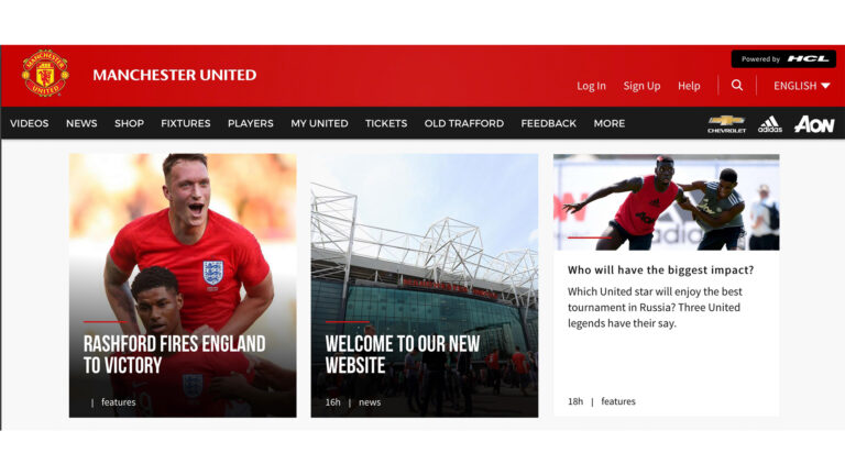
Manchester United has revealed its newly designed website, with a simplified navigation system and improved imagery and video.
The club has been running beta testing on the site and said that it had been getting feedback from fans throughout the design process.
It said that the navigation had been simplified throughout, with a less cluttered menu and a “more powerful search tool.”
There has also been an emphasis on photography and video content. While a latecomer to YouTube, Manchester United recently became the fastest growing sports club to launch a channel on the network.
“Videos are also central to the content we offer – our dedicated team of video editors and reporters will keep you entertained for hours. Meanwhile, our news reporting continues to be second to none – we’re first with the official word on signings, team news, and views from the manager and players,” explained the digital team.
A new secure login and registration system has been added, as has an enhanced digital match day experience.
Its team will be offering in-game stats, fan polls, opinion and punditry, plus live images.
Dedicated sites are also being made for Chinese, Japanese, Korean, French, Spanish and Arabic markets.


