Manchester’s Love has completed a redesign of Häagen-Dazs’ packaging – its biggest overhaul in almost 2 decades.
The company was briefed to make the packaging an “object of desire” and bring to life the brand’s “extraordinary recipe textures, colours and sensations.”
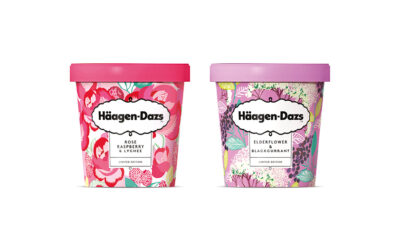
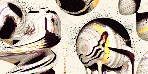
Love approached 13 artists from around the world, each with a distinctive style, to create an illustrated pattern for each flavour. In total 46 designs were created from people including Santtu Mustonen, who’s previously worked with NYC ballet and Converse.
“Love has been a brilliant creative partner on our packaging redesign. We wanted an agency that would challenge us, ask questions and encourage debate about our brand,” explained Jennifer Jorgensen, global marketing director for Häagen-Dazs.
“The process has been a really collaborative approach between the two teams – we’re incredibly excited about the iconic new designs and we hope that consumers both old and new will feel the same way”.
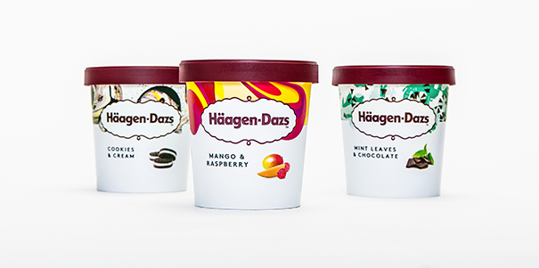
Love has also simplified the Häagen-Dazs logo and brand colour, to reflect the new ethos of “Everyday Made Extraordinary”. This has been specifically aimed at millennials, who are seeking “unique and authentic experiences they can participate in, as well as share online.”
“The packaging re-design was inspired by the brand’s founder who had a love for Scandi sophistication,” said Sam Wilkes, packaging creative director at Love.
“So we drove design simplicity, white space and impactful colour to the fore, commissioning artists from around the world to express the extraordinary flavour experience of every variant. Each response was applied to pack resulting in something bold, modern and Instagram ready.”
The new packaging designs are being rolled out over 101 SKUs, including ice-creams, sorbets and frozen yogurts.


