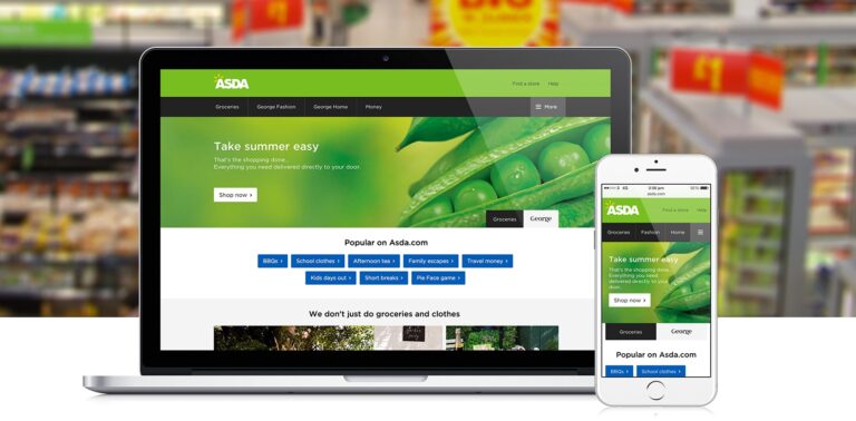
Code Computerlove’s redesign of asda.com has been hailed as a success, with bounce rate reduced by 37% and referral traffic up 24%.

The Manchester digital agency was brought in, to produce a cleaner, fresher feel and layout to the website, to improve the user journey and bounce rate. It applied lighter weight high performing responsive code so as to reduce page load time by around a fifth.
“The team at Asda felt that their existing site had become cluttered over time and wasn’t performing as well as it could and briefed us to deliver greater brand impact, improve signposting to enhance the user journeys and deliver a consistent experience across all devices,” said Rob Jones, client services director at Code Computerlove.
“Our mobile-first design and the introduction of responsive capability has delivered a fast and pleasurable user experience with successful onward journey clicks. The design was the result of extensive user experience testing, with more AB/MV analysis planned for the live site to continue to refine engagement and journey mapping.”
Jones added that the strategy was to simplify navigation across the site and use lifestyle photography to promote its core messages.
“There is a more instant brand feel and by using background imagery rather than banners there is less distraction for users,” he explained.
“It’s also supplied a future-proof, highly flexible solution that will evolve over time and enable Asda to introduce more sophisticated digital techniques in coming months, including personalised content and automate delivery of page variations and content.”
Other changes include a “top visited sections” which have been reduced from 6 topics to just three; a “Trending at Asda” section; and a community page.


