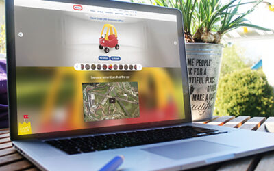
Yorkshire creative agency, The Bigger Boat, has completed the redesign of Little Tikes’ website.
The “complete overhaul” was to reflect the brand’s updated direction and brand values and includes new typography and custom drawings.
The homepage now includes a social media feed from Facebook and Instagram.
“In addition to the new website we also helped to reposition the Little Tikes brand online. We updated the logo to make it simple and flat – as opposed to skeuomorphic – and refreshed the colour palette. The creation of bespoke hand-drawn doodles helped inject personality and fun to imagery throughout the site,” explained creative director Doug Main.
Bigger Boat said the 6 month project took over 500 hours, with the site designed for a mobile-first audience, with calls to action placed deliberately for a user’s thumb.
“The fact that 80% of people use mobile technology when visiting e-commerce websites meant that we had to cater for this audience first and foremost when planning the site – whilst still delivering a rich desktop experience. We tackled the brief from a data-driven perspective to ensure that we delivered the best possible UX,” added managing director, Andy McCaul.
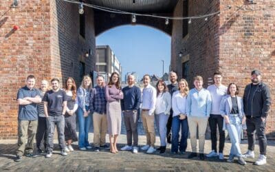
“This was a huge project for our 12-strong team, and we are extremely proud of the finished article. The move away from stock shots and a custom style of text has made the site more eye-catching and vibrant, and given the Little Tikes team a solid platform for growth.”
It was developed using WordPress and WooCommerce.
“We’re really pleased with our new direction and website, which helps to bring our exciting range of toys to life online. Importantly, it delivers on our key objectives – to engage millennial parents, become a brand hub and support our retail partners. We’ve had some fabulous feedback globally and our new brand style is now being rolled out internationally,” added Michelle Lilley, head of marketing at Little Tikes.


