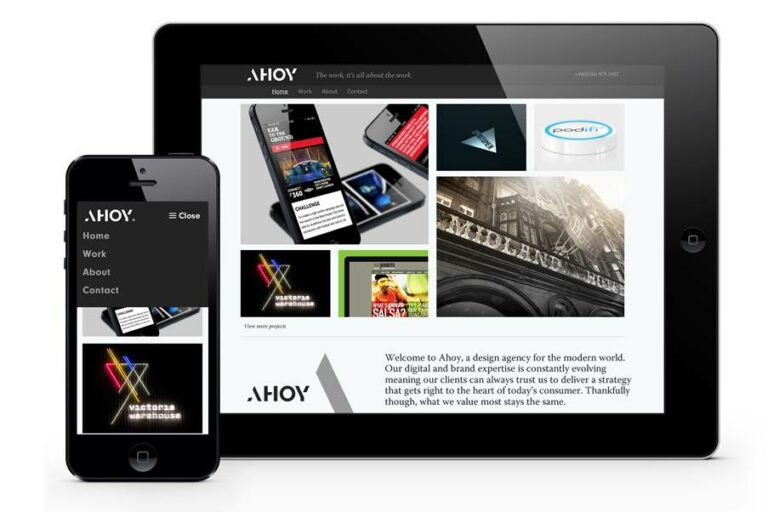
Ahoy in Manchester has undergone a complete rebrand as it underlines its new direction as a fully integrated digital and design company.
Its reworked logo uses a bespoke typeface, integrating a large, abstract A, which it will use as a mirror to reflect the colour, photography or identity of the agency’s clients.
The new look includes a new website and redesigned studio at its Heaton Moor base, plus the tagline: “The work, it’s all about the work’.”

“I’m sick of seeing agencies play it safe and use Helvetica for their logo type! I demanded something different from the team because that’s what our clients expect from us. They trust us to deliver quality, consistency and value and to ensure that their identity and communications translate across both digital and off-line platforms.”
Stringer also revealed that it has added 2 members of staff to its team, to work on front-end development, mobile and ecommerce. It means the agency will now offer .NET and PHP development in-house.


