Following the fast food giant in building a solid design foundation will cut your delivery times, save money and produce a far more reliable brand and customer experience, says Guy Utley, Founder and Creative Director at Leeds agency Tall.
As brand, design and digital leaders, one challenge we always have is showing the ROI of design.
I’m about to spill the beans on the success of well-organised design in business – and no I’m not talking about your neon stand-out colours, your unique look or that perfect tagline; I’m talking about the kind of design that mirrors the thinking that made McDonald’s a sensation.
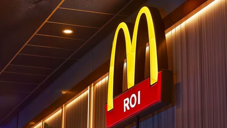
Picture this: if every McDonald’s outlet did its own thing – its own uniform, its own special fry-cooking time, or its own wild gherkin experiment – it would be chaos.
Ray Kroc, the chap who turned McDonald’s into the Godzilla of fast food, would probably shake his head faster than you can say “Happy Meal”. Because – surprise, surprise – the success of the Golden Arches wasn’t just about the fries and burgers – it was about nailing down consistency, having a killer process and a shedload of efficiency.
Instead of letting chaos reign, make sure every bit of content, communication, user experience and design aligns perfectly.
Now, let’s jump from the Golden Arches to today’s world of digital and brand experience, where everyone wants to be the next big thing and they want it yesterday.
You’ve got a superb-looking brand, a solid purpose, and a proposition that’s the talk of the town. But you are also letting growing numbers of internal and external content creators, designers, and developers run wild with their own versions of your brand.
This is like handing the keys of your business to a captain with no compass. It’s fine until you are a thousand miles away from where you want to be, both in money and brand credibility.
Having assisted numerous household-name brands in pinpointing bottlenecks and identifying leaks in both time and resources across diverse teams and departments, it becomes crucial to understand the collaborative dynamics among these teams. This process not only helps unveil bottlenecks but also exposes any inefficiencies that may be hindering overall productivity.
In my experience, it normally boils down to these few key reasons:
- Multiple team direction
- Siloing and collaboration challenges
- Lack of alignment
- Technical debt from design choices
- Design and development duplication
Let’s consider another example to drive home the point. Imagine an e-commerce giant that has achieved massive success through its seamless online shopping experience.
However, as the company expands globally, individual teams in different regions start creating their own user interfaces, checkout processes, and design elements to cater to local preferences. This decentralisation results in a disjointed and inconsistent customer journey, leading to frustration and decreased conversion rates.
How much of this is going on is down to the size of the organisation, speed of growth and general understanding of the importance of design.
So, look to channel your inner McDonald’s and look to get things right from the get-go. Building a solid design foundation – in this case a design system for your brand – will cut your delivery times in half, shave off 30-40% of your costs, and end up with a brand and customer experience that is way more reliable.
It’s actually not rocket science; it’s about keeping it clear, planned, consistent and oh-so-pleasantly repeatable. Instead of letting chaos reign, make sure every bit of content, communication, user experience and design aligns perfectly.
Design done right can be your secret sauce to faster, cheaper and consistent delivery!

