Digital stress is now ‘a thing’ according to health specialists; and technology’s relationship with stress is a key theme– highlighting how consumer’s digital experiences could actually be stressing them out.
Andy Culbert from Manchester’s MERó has been working on a new customer portal and app for one of the world’s biggest private healthcare companies and explains how a website or mobile app design can be used to “relax and reassure” users.
A new study in 2018 (the largest known study of stress levels in the UK) revealed that 74% of respondents had experienced ‘overwhelming stress’ in the past year. For me this highlights that catering for stressed out customers is something most digital designers now need to build into their work; considering how stress influences the end user (both mentally and physically) during the design process is more important than ever.
Stress can lead to extreme changes in personality, limiting a person’s ability to cope with processes they would usually find ‘normal’ or ‘easy’. For example, a person experiencing stress is likely to be impatient, indecisive and distracted – they’ll have less tolerance with site errors or confusing design elements.
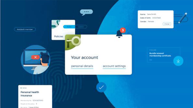
Tasked with the design of a full-service portal and app for a private healthcare brand, where users can do anything from renew their policy to book a hospital appointment, we knew that some people would be interacting with the app at a very stressful point in their lives. They could be mid-diagnosis, managing an existing medical condition or attempting to communicate with a medical professional. How this heightened state of anxiety would influence their responses, therefore, had to be a major consideration in every design choice.
In-depth research showed us that the designs had to be reassuring; guiding users and providing answers or information in a clear, easy, digestible and informative way.
And in the same way a person may alter their tone of voice and vocabulary when trying to calm a person in distress, there were some clear tactics we could apply to mitigate negative responses.
From this research three key take-outs formed our creative approach.
Adopting calming colourways
Perhaps the most obvious design element, but vitally important, colour ‘a property that causes visual sensation’ is one of the best ways that designers can regulate the emotional response of users.
In Western colour psychology, blue is widely proven to provoke feelings of tranquillity and serenity. It’s non-threatening and reassuring. A colour that conveys trust.
Blue already featured heavily within the brand colours, we selected shades of blue with extremely high accessibility levels, to form the background to the healthcare app design. Aside from these principal colourways, we used colour sparingly, limiting any distractions.
Where we wanted to highlight an important action (based on detailed persona analysis of who was using the app and why), we applied white space – providing a clear signpost to functionality that would help users along their journey. Additional colours were introduced for alerts. But, while these colours were chosen from the same part of the spectrum as recognisable ‘alert’ signifiers (usually red or orange), we muted them and made them ‘harmonious’ in comparison to if they had been applied in their true form.
In testing, users responded well to the soothing colours of the design. They liked that there weren’t any bright or clashing colours.
High levels of accessibility ensured the design was consistent across platforms – a way to further reassure user and guaranteeing a good user experience regardless of the device or location they were accessing it from.
Design that directs and supports
A guiding principle that we referred to throughout the project was ‘cognitive overload’, a term rooted in psychotherapy describing when a person’s brain has too much information to process thus limiting their ability to perform tasks properly. We knew customers arriving at the app or portal might already be ‘overloaded’ mentally and that this would negatively impact their ‘working memory’ – the part of the brain that is used to complete a task at a given time.
When working memory is compromised people are easily distracted, unable to make decisions and find simple processes difficult to complete. The design had to fulfil the function of guiding them through their journey, as well as being simple itself.
Within the app and portal, content and important information is given space to breathe, allowing users to take in each-piece information at a time. Content is easy to read with a high standard of legibility. Simple design elements were used so as not to compete with one another for the brain’s attention. Bespoke iconography versus off the shelf iconography, was created to be very straightforward and easy to understand, limiting confusion or the need for trial and error deciphering their purpose. We also created custom illustrations that served as visual aids to lead users through the content, whilst also adding personality to what could appear cold and unwelcoming.
Another way we eased cognitive overload through design was through limiting the decisions a person had to make. We restricted options, with only essential information displayed at any given time. Content was reorganised into smaller chunks to help users navigate, process and remember it better. Data was grouped to make it memorable.
Within testing we trialled many variations of the colour, size, positioning and prominence of buttons to ensure users were sure of their next course of action. The winning layouts were ones that made very obvious what users needed to do to take the next step. We also worked with in-house teams to remove unnecessary steps within the UX.
Movement within the design was an effective way of serving up content at just the right time. It needed to be well considered though, enhancing the user experience and prompting key content rather than distracting users. When well executed, the speed and smoothness of moving elements have a really calming effect on the overall experience.
Creating an authoritative identity
While the overarching brand identity within the app had to be supportive, it also needed to project authority. This was achieved through tone of voice and attention to detail. We wanted users to have faith that they would end up in the right place, feeling the same level of trust and reassurance online as they would when meeting a doctor or member of staff in the real world.
An authoritative voice can be achieved by consistency. Design cues along with tone of voice should be consistent throughout. Mistakes of any kind, especially broken links, typos and grammatical errors serve to distract and undermine never dropping attention to detail throughout the project is a must for lowering stress levels and increasing trust.
We guaranteed consistency across the app and portal by building a fully-responsive style guide that built the pages and component features. This was a vital step in the process. It consolidated the link between design and build. Development teams had insight, they could see how each page was laid out, they were able to build pages quickly and efficiently as well as being able to gain access to the code– saving time and resource.
So as the UK’s – and worldwide – stress levels continue to rise, digital design can find ways to deliver a counter balancing experience that at least won’t create more stress or frustration. The bigger picture, and something we must take into consideration, is how to stop people feeling pressure from too many emails, huge consumption of social media and discussions on online forums.


