CBBC has unveiled its first brand refresh in nine years.
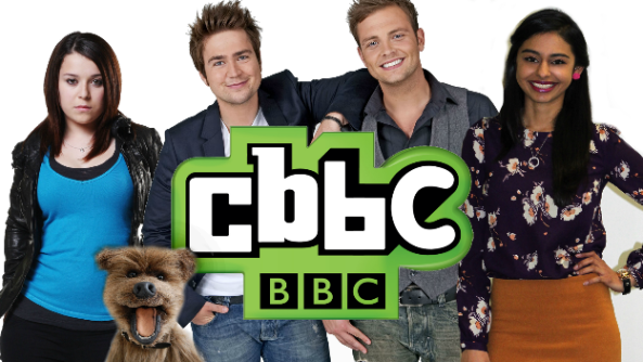
The new “bright, mischievous and sophisticated” look replaces the green, black and white logo that was designed in 2007.
Red Bee worked with CBBC on the new look, the same London agency responsible for the recent – controversial – BBC Three makeover.
 The new CBBC logo
Introducing the rebrand in a blog post, CBBC controller Cheryl Taylor said: “We are now the proud owners of a versatile and dynamic logo which works in every space and is designed to appeal to both ends of our broad age spectrum.
“Our new logo is not overt, it doesn’t scream ‘Children’s TV’ but its various iterations are fun and unpredictable and have broad appeal.”
The rebrand includes a whole new set of idents which “marry the well-known grooves of everyday life – like walking to school with your friends or enjoying a sleepover – but with an added sprinkle of special CBBC ‘Just Imagine’ stardust”.
Watch a film introducing the new look:


