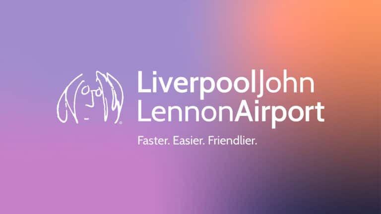

Liverpool John Lennon Airport has launched a refresh of its brand as it looks to the future.
With new typography and colour scheme, it said that the new modern look was more appropriate for digital.
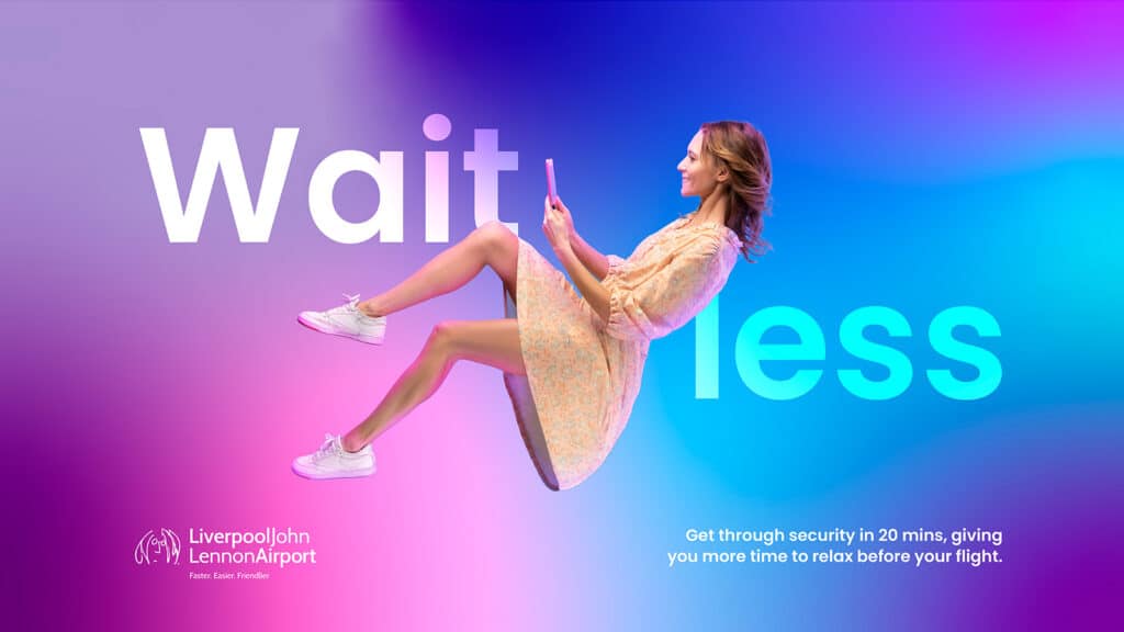
The free-flowing colour scheme is called “The Aura” and has been designed to be a visual representation of its “Faster, Easier, Friendlier” experience.
“It is really exciting to reveal our new brand to the public. This is the culmination of months of work, so it’s nice finally to get it out there for everyone to see,” explained LJLA’s Digital Marketing Executive, Tom Woods.
“The original logo was created in 2001 before smartphones and social media, so a refresh was long overdue and now seemed like the perfect time.”
Woods led the rebrand, working with Liverpool creative marketing agency, Kenyons.
“It has been a privilege to reimagine one of the most iconic names in the UK,” said Aaron McDonald, Creative Development Director at Kenyons.
“We wanted to create a new look that represented the friendliness, positivity and vibrancy that the airport and its staff show every time we visit. The project has been a labour of love and we cannot wait for their passengers to see it.”