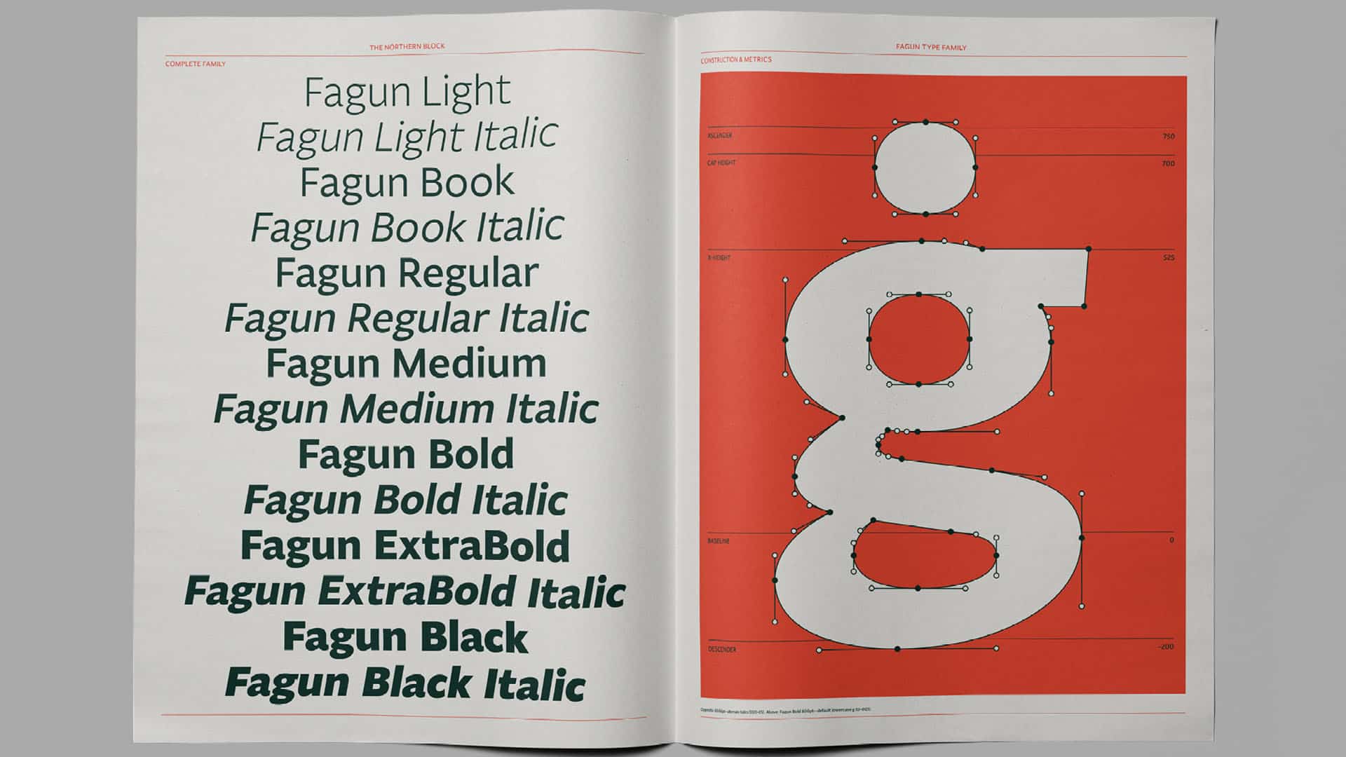


The Northern Block has released a new “super legible” font, inspired by Charles Dickens’ novels and characters.
Fagun, a deliberately misspelt homage to Fagin was designed by the North East studio’s founder, Jonathan Hill.
“Fagun embraces the all-important dimension of inclusivity and contemporaneity which innovation always demands,” he explained.
“From my perspective, Fagun differs in the way that it does not commit 100% to true calligraphic principles. To give the typeface a proficient level of modernity, Fagun combines both hand-drawn lines with pure straight mathematical lines.
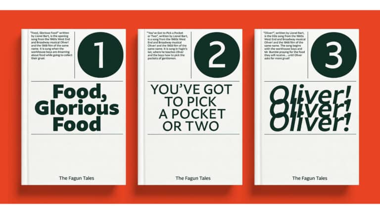
“Alternative characters are not offered by similar typefaces, so with Fagun, I wanted to create some alternatives that would give the design a different flavour and reinforce the functionality in readable text.”