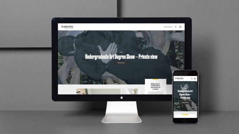
Leeds agencies, Numiko and Only have combined to create a new website for Goldsmiths, University of London.
Their brief was to “redefine what university websites should be” and act as an “inspiration” to the rest of the sector.
“Goldsmiths is a creative and cultural powerhouse and we’re thrilled to have been a part of this exciting new phase. Competitive advantage can easily be achieved by investing in a superior digital presence, as this is most prospective students’ main touch point,” explained Marie Kitney, executive producer at Numiko.
“The majority of UK students regard online resources to be just as important as offline experiences when selecting a University [QS Digital Solutions Report: “Students Online: Global Trends 2015”]. Higher Education Institutions that are ahead of the curve have recognised this and have elevated digital to Board level, with some even appointing Directors of User Experience to their senior management teams.”
Kitney added that as nearly 80% of young people said that a campus website effected their perception of an institution and 70% of students viewing the site on a mobile, they needed to really focus on user experience.
The site also had to be updated in-line with its new branding.
“The Goldsmiths website has many facets. It represents an opportunity to engage and excite prospective students from all over the world but must also serve as a highly useable, information-rich resource for faculty and students currently at the University,” added Only creative director, Matthew Tweddle.
“The redesign attempts to cater for every eventuality – inspiring through expressive use of colour and typography where appropriate and falling back to more accessible and readable design for more informative content.”


