


 Poor old local newspapers. If they hadn’t got enough to contend with over falling circulations and reducing staff numbers, they’re now in the firing line for their choice of font.
Respected journalist and former newspaper chief Steve Dyson has taken aim at Lancashire’s weekly newspapers with a full throttle attack on their design at his HoldTheFrontPage blog post this morning.
“Why on earth has Trinity Mirror started using such an ugly headline typeface on its weekly newspapers in Lancashire?” he asks, before launching a tirade against the choice of headline typography.
“It’s not often that I carp on about such things, but I physically cringed at the three decks of serif-gone-mad that I found adorning the front of the Accrington Observer…………..
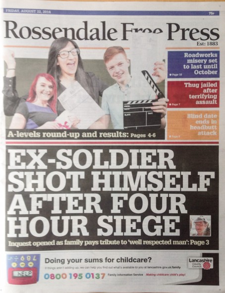
“It looked even worse in four decks of white-on-black in the Rossendale Free Press, a sister paper of the Observer, completely dominating the tiny thumbnail picture of the deceased soldier.
“This strange font – which reminded me of those old plastic stencils we used at primary school – was nowhere to be seen when I reviewed the Free Press for this site back in the spring of 2011, so goodness knows why it has been introduced.”
What do you think? Is the look of a publication important to you? Let us know via the comments below.