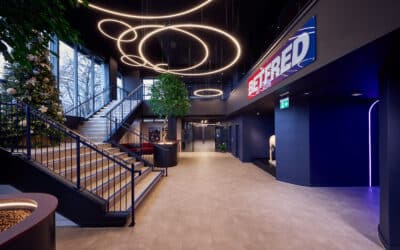
Ahead of its 25th anniversary next year, Lowry has undergone a major rebrand.
It’s been carried out by Manchester’s Edit, to reinforce the space as a catalyst for change in the arts and culture sector and for people from all backgrounds “to experience culture on their own terms.”
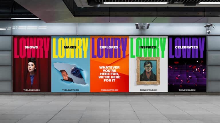
The agency has also created Lowry’s first ever brand campaign to communicate its new vision and values, to focus on ‘a city where the benefits of creativity are felt by the many not the few’.
“For most, arts and culture can feel elitist and intimidating, but from our very first visit we knew that was not a problem for Lowry,” said Khadija Kapacee, EDIT Managing Director.
“We immediately knew our job was to create a brand that captured the huge, warm, Salford welcome that you get as you step into Lowry’s iconic Salford Quays home.”
Karen Hughes, EDIT Creative Director added:
“For an organisation that should be hugely proud of the positive role they play in people’s lives, we felt their current brand presentation was far too humble and wanted to create an unapologetically bold and impossible-to-ignore identity, deserving of an organisation that has so much to shout about.”
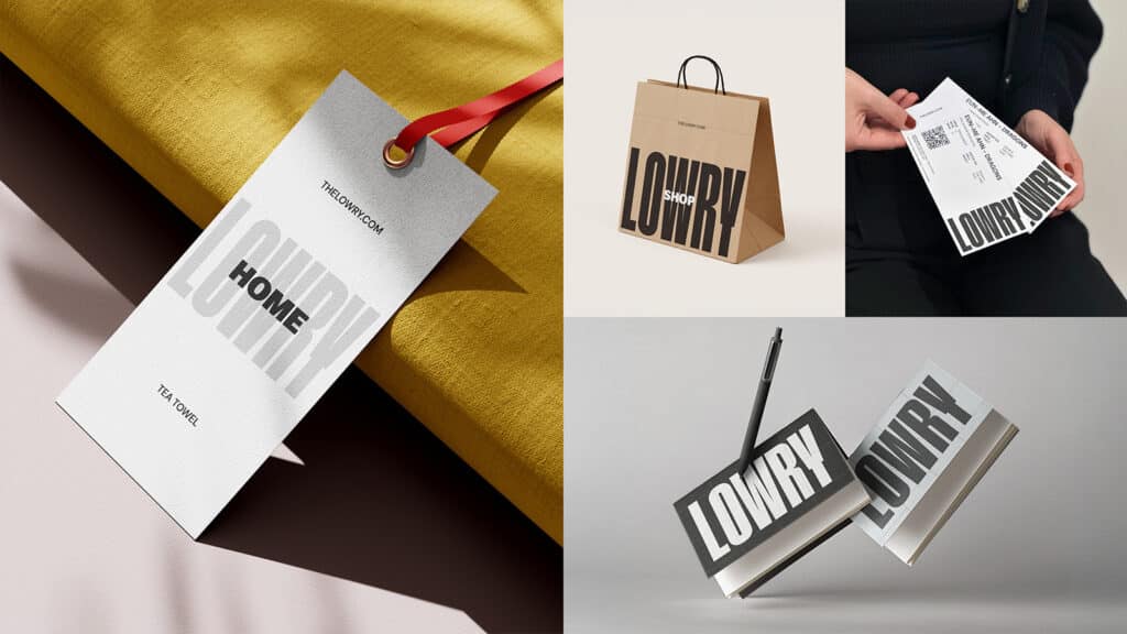

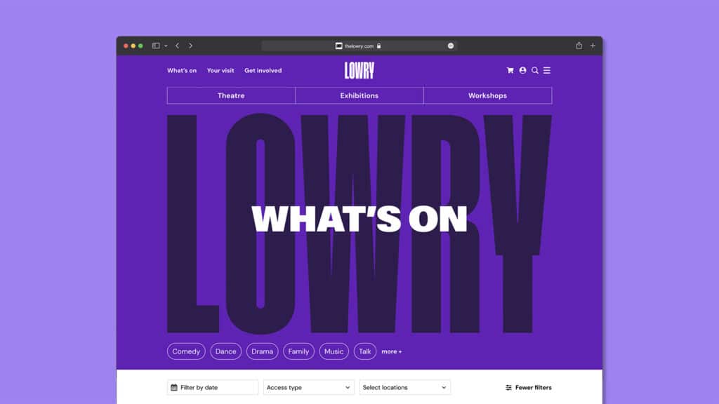
This identity features bold, industrial-era typography and a vibrant colour palette, inspired by the inside of its iconic building.
A new brand narrative is based around a straight-talking, Salford-inspired tone of voice, this has been done alongside Reed Words.
EDIT has also come up with a new masthead-style logotype and subtle name change “to make it sound less like a venue” – it is now Lowry, rather than “The Lowry.”
“Quirky and playful” photography and art direction was carried out in collaboration with Manchester photography team Shaw&Shaw.
The website was designed by Culture Suite.
“Through an extensive consultation process after the pandemic, we realised that Lowry needed to realign its brand position to be much clearer and bolder,” explained Rachel Miller, Lowry Director of Audiences, Sales & Marketing.
“We have so much to offer as an organisation but that is often our challenge when describing ourselves to audiences and communities. From day one of working with EDIT they got us! They understood the challenge of our complexity whilst embracing our achievements of the last 25 years that have been realised through the power of creativity. We have been in very safe hands and are thrilled with the results of the project.”
The intention was to unify its programmes, products, food and retail under one core identity and remove the disconnect between “Lowry’s corporate-style identity and the warm and creative spirit that is evident inside its bright-coloured maximalist building.”
The new campaign will run across Salford and Manchester, including a brand film and OOH advertising.

